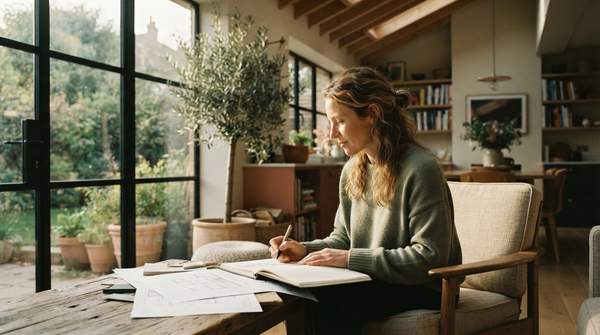
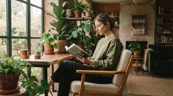
Students consistently prefer blue interiors over any other color, not just for aesthetics, but because this hue actively facilitates studying and promotes a calm mood, according to research published in PMC. This reveals a direct, measurable link between specific colors and human cognitive and emotional states, proving thoughtful design can profoundly shape daily life.
Homeowners often select colors based on fleeting trends or personal preference, inadvertently overlooking scientific evidence demonstrating that specific hues predictably and powerfully impact mood regulation and stress reduction. This oversight means many families miss crucial opportunities to enhance well-being through intentional design.
Understanding and applying color psychology in home design is becoming an accessible, essential tool for enhancing mental well-being. Decoration transforms into a functional aspect of personal and family health. By choosing colors strategically, homeowners cultivate environments that support emotional balance and cognitive function.
The Palette of Peace: Which Hues Truly Calm?
A profound connection exists between a calm mood and a preference for blue in interior spaces. Blue is not merely a pleasant color; it is a practical choice, actively promoting tranquility within a home.
While blue clearly stands out, broader research indicates that neutral and light natural colors are generally best for promoting calm, according to ForOthers. Shades of blue are particularly known to decrease stress, aligning with these findings. This suggests a hierarchy of calming effects: while many natural colors offer general serenity, blue provides a distinct, task-specific cognitive benefit beyond mere relaxation. Its cool depth quiets the mind, fostering an environment where peace is not just felt, but actively cultivated.
Beyond Relaxation: Blue's Cognitive Boost
Blue, as an interior color, specifically facilitates studying, offering more than just peace. This reveals the calming effect of blue isn't merely relaxation; it actively enhances cognitive functions, implying a deeper neurological impact beyond subjective preference.
While neutrals offer general calm, vibrant hues like blue and green provide targeted psychological benefits, such as improved focus for students. Generic 'calm' colors often lack this specific cognitive boost. Strategic use of blue actively supports concentration, making it a valuable tool for creating productive and peaceful spaces. Based on PMC data, families designing home study spaces or children's rooms should prioritize blue hues. This color actively enhances focus and academic performance, not just mood, unlocking academic potential within the home.
The Sanctuary Effect: Why Your Home Needs Calm
Creating a calm home environment through intentional design provides a crucial sanctuary, actively supporting the mental and emotional well-being of all family members. Without this deliberate approach, homes risk becoming sources of subtle, ongoing stress, rather than havens for restoration and growth.
The strategic use of colors like blue transforms a home from a mere refuge into an active tool for improving family dynamics and academic performance, especially for children. This proactive design leverages color to cultivate environments that foster emotional stability and support daily activities, weaving well-being into the very fabric of daily life.
Creating Your Calm Haven: Practical Steps
What are the key elements of a calming home design?
Beyond color, a calming home design integrates natural light, organized spaces, and natural textures. Maximizing natural light through windows and minimizing clutter reduces visual stress, promoting openness and calm.
How can I make my home feel more peaceful and serene?
To foster peace, incorporate soft, indirect lighting. Minimize electronic screens in relaxation areas. Introduce plants to connect indoor spaces with nature, creating a restorative environment.
What colors promote a calming atmosphere in a home?
While blue excels for calm and focus, soft greens, muted grays, and warm off-whites also contribute to serenity. These colors, often found in nature, reduce visual stimulation, promoting stability and restfulness.
If homeowners embrace the scientific power of color, future homes will likely be designed not just for beauty, but as intentional canvases for mental well-being and cognitive enhancement.